The climate movement has never had more data. Satellites map shrinking glaciers in real time. Sensors record rising temperatures by the hour. Researchers can estimate everything from groundwater depletion to carbon emissions with remarkable precision.
Yet much of climate communication still struggles with a fundamental problem: people don’t experience gigatonnes of carbon dioxide. They experience an unbearably hot commute, a restless night’s sleep, a neighbourhood stripped of shade, or the silence left by birds that once filled the morning air.
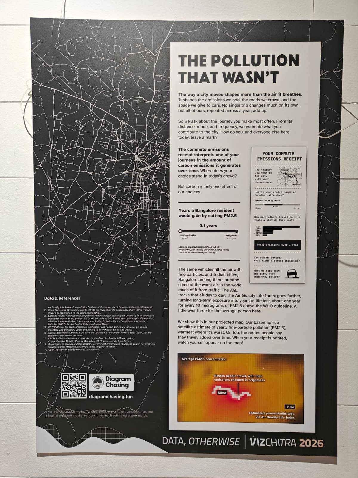
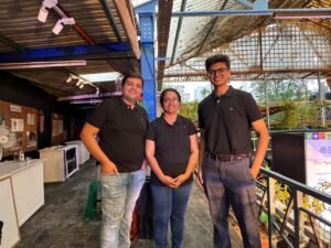
“The Pollution That Wasn’t” is a portrait of emissions prevented through public transit at VizChitra 2026 by Aditya Jain, Designer & Technologist, Vivek Matthew, Engineer and co-runner Diagram Chasing, and Aman Bhargava, Developer, and also a co-runner at Diagram Chasing. Photograph by Madhur Singh.
That gap between evidence and experience emerged as a recurring theme in conversations with data visualisers exhibiting at VizChitra 2026. Their work offers an important lesson for climate journalists, scientists and campaigners alike. The future of climate movement may lie not in finding more data, but in helping audiences see themselves within it.
The best data visualisation, they argue, does not simplify science. It makes it tangible. It replaces abstraction with recognition and transforms information into something people can remember long after they have looked away.
We experience climate, but don’t often notice it
Climate journalism often relies on global averages, annual reports and scientific terminology. Necessary as these are, they can create distance between the audience and the story.
For data journalist Surbhi Bhatia, whose installation Panes of Heat maps urban heat onto familiar cityscapes, the starting point should be people’s everyday lives: “People experience climate, not datasets. We notice that the walk to work has become hotter, that it’s harder to sleep through warming nights, or that a neighborhood is losing trees and has too little shade, as a lived reality instead of chart, number or a global average.”
That insight is deceptively simple. Climate communicators often begin with datasets and then search for examples. Data visualisers tend to work the other way around. They begin with lived experience and use data to explain it.
“Good data visualisation bridges the gap between statistical measurements and lived experiences. It gives people an entry point into complex information by placing it in their own contexts,” Bhatia explains, “When people connect data to places they know or experiences they’ve had, it is far more likely to inspire action.”
That philosophy shapes Panes of Heat, which places temperature data within recognisable urban settings rather than conventional charts.
“Instead of presenting temperature as a number, we place heat data within familiar urban environments so people can connect what the data says with what they actually feel, and show how that experience of heat can be degrees apart. That moment of recognition, ‘I’ve stood here, I’ve felt this’, is often more powerful than any statistic.”
So, climate communicators: Numbers matter, but they rarely become memorable until readers recognise themselves within them.
The power of metaphor
Another striking feature across the exhibition was the use of ordinary objects to explain complex systems.
Rather than relying on bar charts or dashboards, many installations used physical materials, textures and metaphors that audiences instinctively understand.
From a stitch to a plate to a printed receipt, familiar forms became bridges between data and experience. “The Pollution That Wasn’t” was Aditya Jain, Aman Bhargava and Vivek Matthews’ exhibit which issued you a receipt showing the carbon footprint of your daily commute. (This writer felt pretty confident they’d ace this test because they work from home; but the weekly taxi rides put their footprint way higher than those who traveled to work by public transport everyday.)
For journalists, this holds an important takeaway: news stories often prioritise completeness over clarity, and certainly over readability. Designers, by contrast, appear more willing to sacrifice detail in service of understanding. This is why writing and data visualisation make such a powerful team.
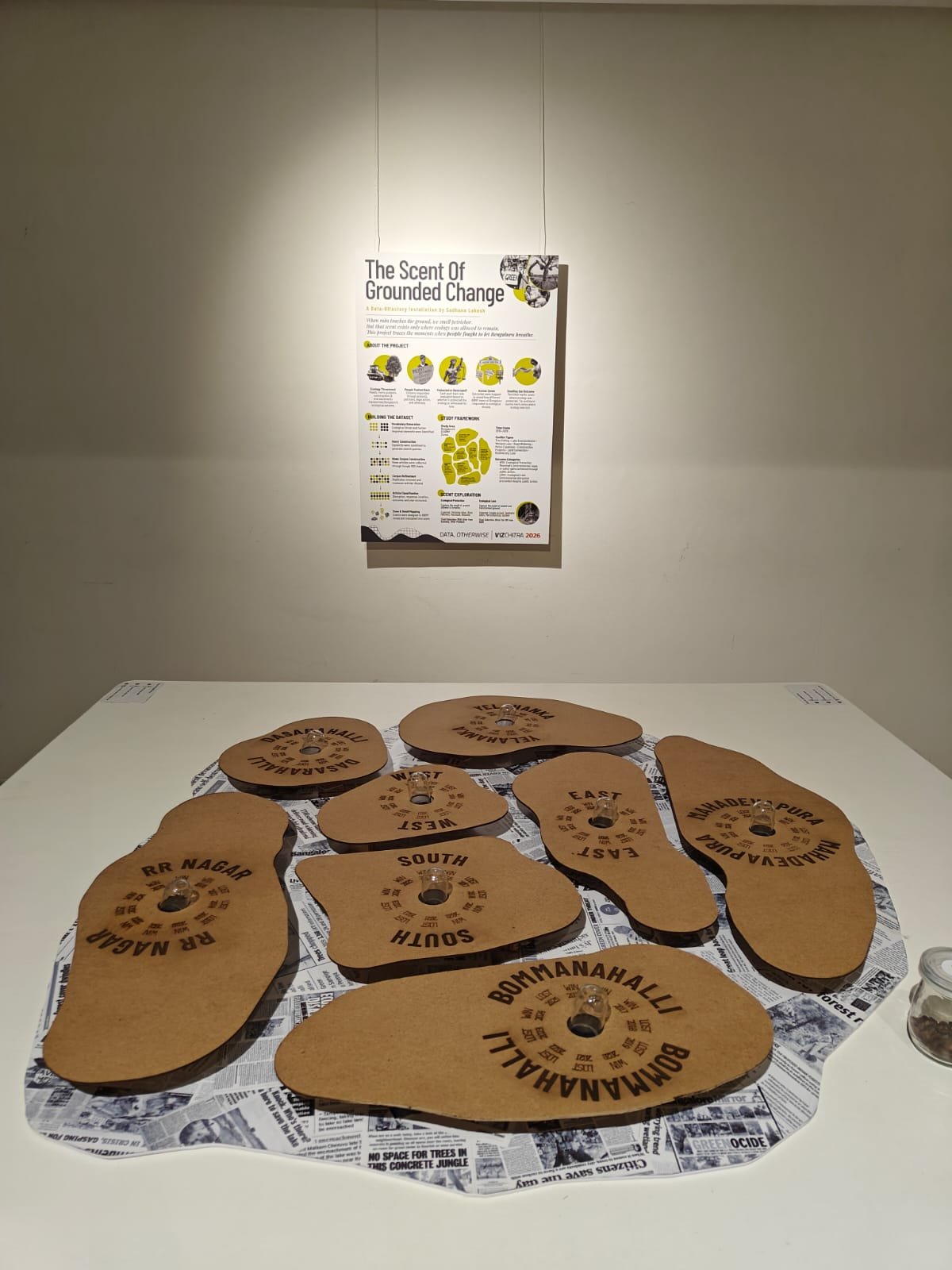
“The Scent of Grounded Change” is an olfactory archive of rain, land and urban change. This project maps ecological disruptions across Bengaluru’s zones alongside the pushbacks that emerged in response. It asks a simple question: how often did collective action succeed in protecting the city’s ecology, and how often was the soil allowed to breathe? The piece is by Sadhana Lokesh, UX Designer, Health Care Organisation. Photograph by Madhur Singh.
Edit ruthlessly
Several interviewees returned to a principle every good editor already knows: deciding what to leave out is as important as deciding what to include.
Shreya Dan, a Master’s student in Information Design at the National Institute of Design, Bengaluru, believes the biggest mistake is trying to communicate everything at once: “Climate data is often difficult to understand not because it’s complicated, but because it’s disconnected from our everyday experiences. Data visualization can bridge that gap by translating abstract numbers into something people can relate to.”
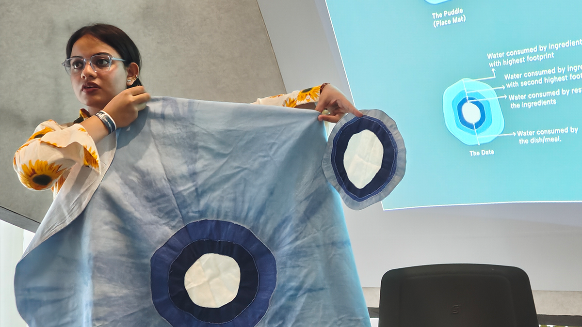
Her data installation, “Puddle Beneath The Plate”, showed how interaction deepens understanding. A table is set for a meal, and many common meals are placed on individual placemats designed to resemble puddles of water. Ripples of various sizes depict the meal’s water footprint in proportional scale, creating the illusion of a real puddle beneath the plate, something present yet typically unnoticed. Visitors move around the table, compare meals, and observe variations in scale, and explore the water footprint of everyday meals – the total freshwater consumed across the food supply chain, from cultivation and irrigation to processing and distribution.
“[W]hen people can touch, feel or interact with the data, they begin to empathize with the numbers rather than simply read them,” Dan says. Her advice to communicators: Start with the human question before the data question. “Before creating any visualization, ask yourself: What should someone take away from this? What is the one idea they should remember, or the one question they should be able to answer after seeing it?”
The same could apply to journalistic stories. “More data rarely creates more understanding but careful editing, thoughtful framing and a clear narrative does the work,” she says, in advice that applies just as readily to feature writing as it does to visual design.
Don’t decorate data. Become it.
Singapore-based Vishal Garg and his daughter Vaanya Garg explored the disappearance of India’s house sparrows in their installation. “The best visualisation does not decorate data. It becomes the data,” Vishal says. The installation used jute rope to build nests and sand to represent urban expansion.
“In our artwork, the jute rope nests are not symbols. They are made from real nest-building material, and their number is the data itself,” he said, “When someone counts two nests on the final canvas instead of ten on the first, or sees the grey taking over clean skies and earthy tones, they experience the change instead of simply reading about it.”
For climate storytellers, the lesson is profound. Good communication is about designing an experience through which audiences arrive at that evidence themselves.
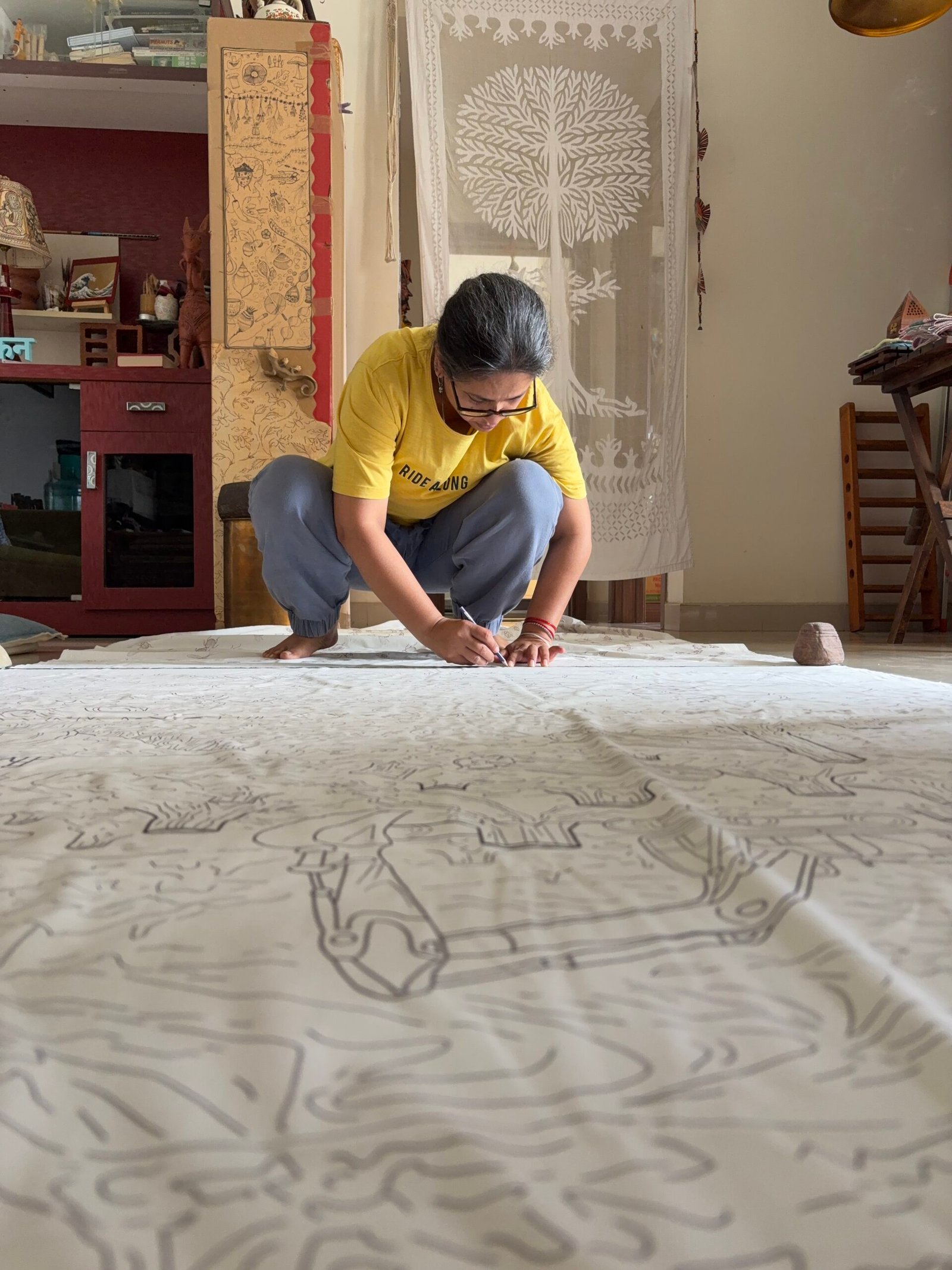
Behind the scenes from Meghana Singh’s exhibition “Vanishing Wings,” an immersive walk-through textile installation that visualizes the decline of insect populations as a consequence of anthropocentric development and ecological disruption. Meghana is a Professor at Srishti Manipal Institute of Art Design and Technology. Photography by Megahana Jain Singh.
Local stories beat global statistics
Climate communicators are increasingly aware that audiences connect most strongly with places they know. Big numbers rarely move people; real people and experiences do – and the closer to them, the better.
As Garg put it, national statistics only become meaningful when rooted in local realities. “National statistics matter, but people connect with places they know,” he says, citing examples of neighbourhoods and cities where sparrows have disappeared entirely. “Those local stories often say more than a national percentage.”
That principle extends well beyond biodiversity. Whether covering heatwaves, flooding, groundwater depletion or air pollution, local evidence often communicates urgency more effectively than global datasets.
Be honest about uncertainty
One quality distinguished several projects at VizChitra: they acknowledged uncertainty rather than hiding it or reasoning it away.
Discussing the sparrow installation, Garg emphasised the importance of separating measured evidence from informed estimation. “We clearly separate what is measured from what is estimated,” he said, adding, “Bird monitoring in India began only around 2008, so our 1980 baseline is based on the best available evidence, not direct measurements. We say that openly.”
Understanding before action
Across the conversations, one idea surfaced repeatedly.
Climate communication is often evaluated by whether it changes behaviour. But before people act, they must first understand, and be moved to act. And before they understand, they must recognise themselves in the story.
As Shreya Dan reflects on her own journey from fashion design to information design: “My journey has been about moving from designing products to designing understanding.”
It is a line that could easily describe the future of climate communication itself.
Climate journalism will always need evidence, rigour and scientific accuracy. But if these conversations at VizChitra suggest anything, it is that communicators must help audiences feel what the data already knows.
Madhur Singh has covered the environment, renewables and climate for over 15 years. She is founder-editor, Climate Action Live.
Inspired to Take Action?
Tl;dr: A summary for the busy, the curious, and the done-for-today
Connect data to lived experience: People don't feel gigatonnes of CO? — they feel heat, sleepless nights, and silent mornings. Start with everyday experiences, not global averages.
Use metaphors and familiar objects: Receipts, plates, and nests make complex systems understandable. Physical forms bridge the gap between abstract numbers and real life.
Edit ruthlessly: Don't try to communicate everything. Ask: "What's the one thing someone should remember?" Clarity beats completeness.
Local stories beat global stats: People connect with places they know. A neighborhood's disappearing sparrows say more than a national percentage ever will.
Be honest about uncertainty: Acknowledge what's measured vs. what's estimated. Transparency builds trust and credibility.